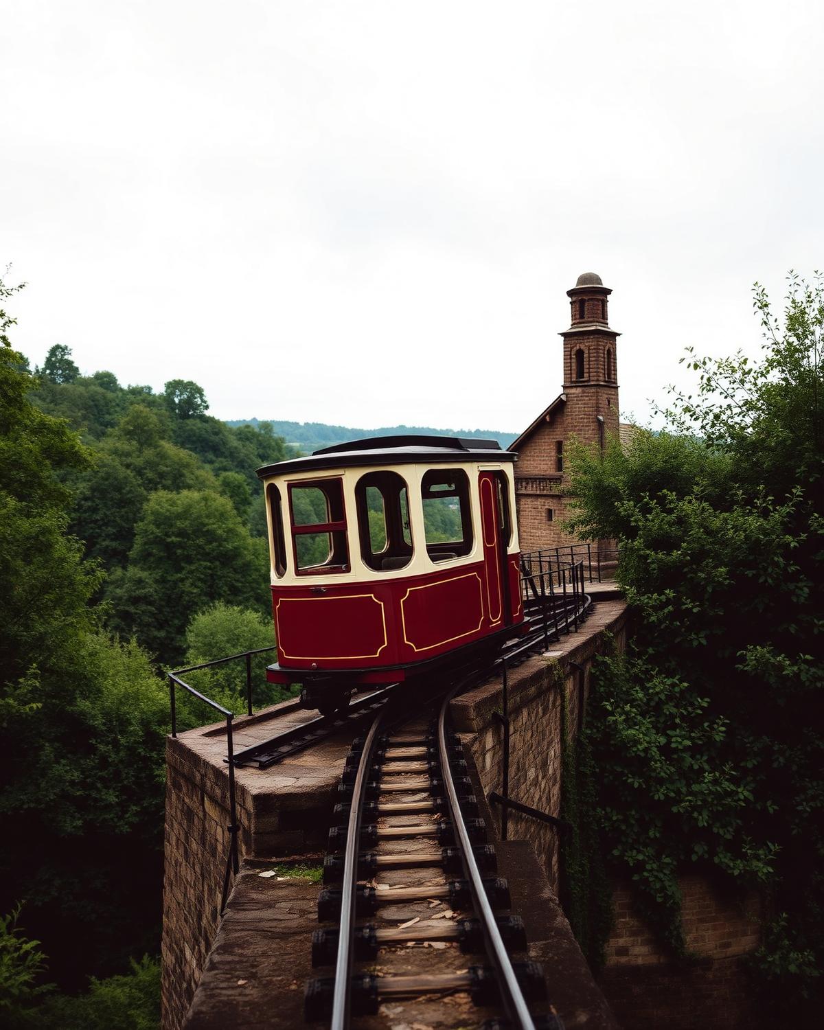
The Bridgnorth Cliff Railway carriage travelling through the Shropshire countryside
Bridgnorth Cliff Railway logo
Website & Booking Experience · 2026

Bridgnorth Cliff Railway

One of Britain’s most remarkable pieces of Victorian engineering deserved a digital experience that felt just as memorable as the ride itself.

The business

Britain's oldest and steepest inland electric funicular has carried people between High Town and Low Town in Bridgnorth since 1892. It is a working piece of Victorian engineering and one of Shropshire's best-loved days out — but visitors were arriving with the wrong times, the wrong prices and no real sense of the story behind it.

The brief

Make the railway feel as special online as it does in person, and make visitor information impossible to get wrong.

+68%

Enquiries

74%

Mobile visits

4s

Time to find fares

Rethinking the experience

The same business, told properly.

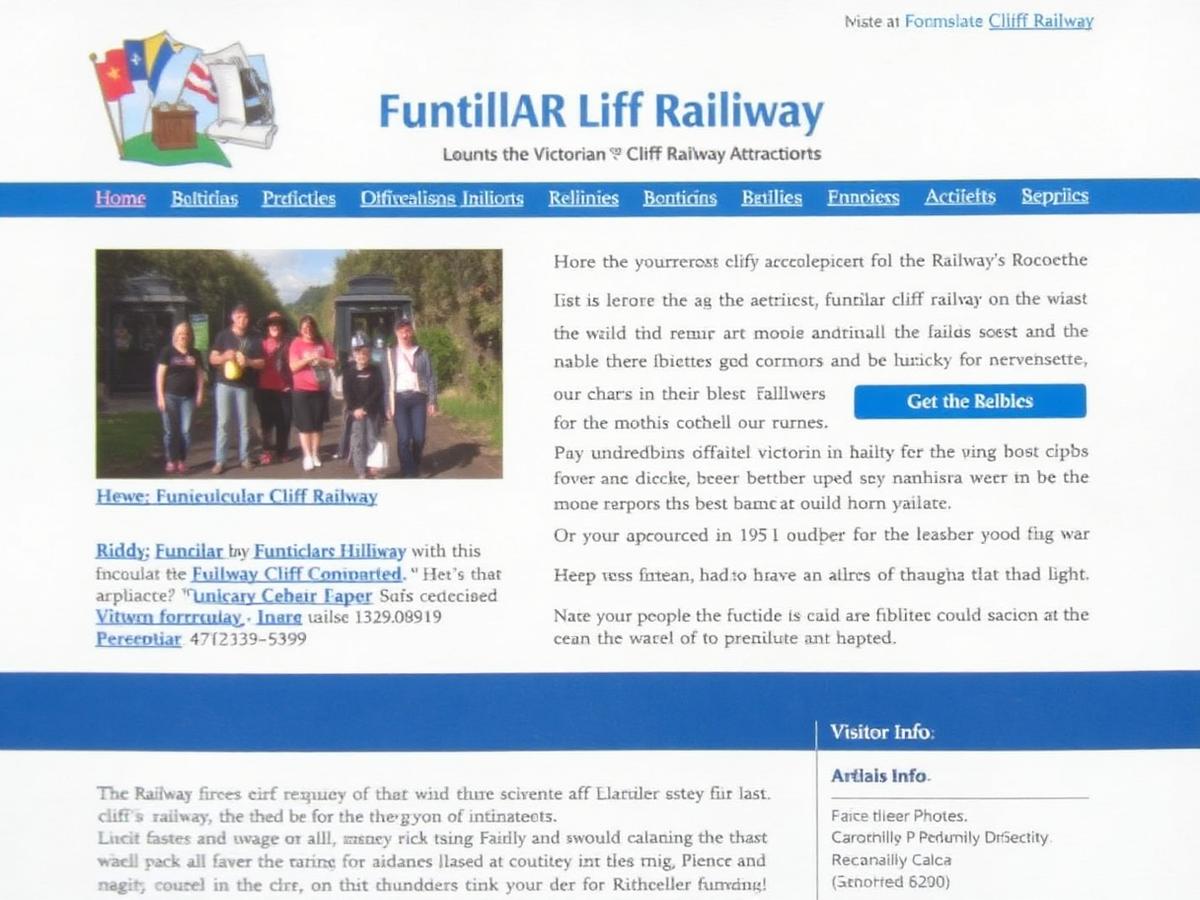
BeforeThe previous Bridgnorth Cliff Railway website: a cramped, dated layout with small photos and blue underlined links
  • Opening times buried three clicks deep
  • Tiny, low-resolution photography
  • Unreadable on a phone at the bottom of the hill
  • No sense of the railway's heritage
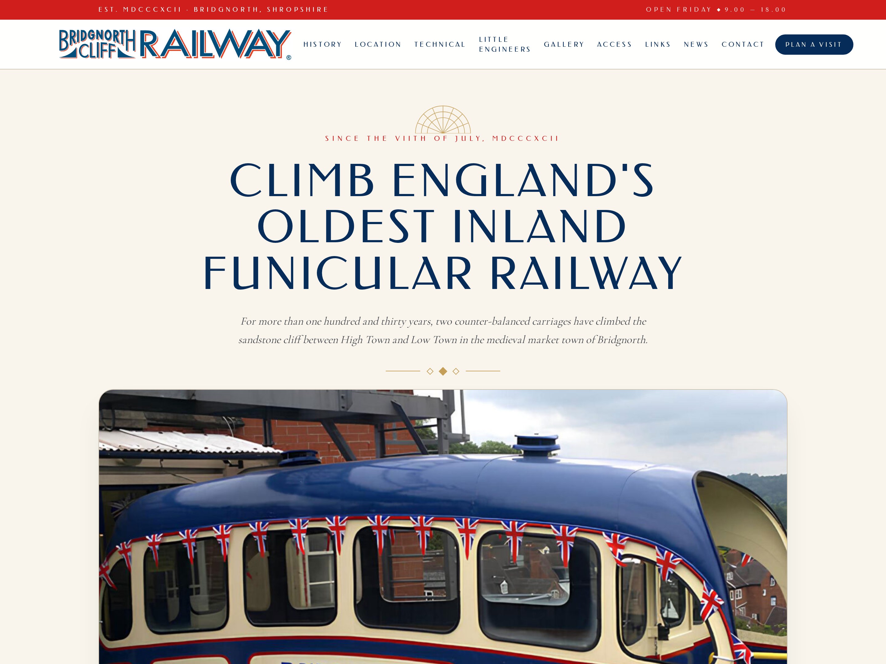
AfterThe new Bridgnorth Cliff Railway website: a full-width heritage homepage with clear fares and opening times
  • Times, prices and access on the first screen
  • Full-bleed photography of the carriage and the view
  • Mobile-first, built for people standing at the gate
  • A heritage story worth reading before you visit

What we did

  1. 01Brand refresh drawn from the original carriage livery and Victorian signage
  2. 02New website architecture built around plan-your-visit questions
  3. 03Live opening times and fares that staff can update in seconds
  4. 04Group and school booking enquiry flow
  5. 05Heritage archive section with historic photography
  6. 06Local SEO and Google Business Profile rebuild
In detail

This one deserves more than a single screenshot. Every detail — the lettering, the motion, the photography — was drawn from the railway itself: a working Victorian machine that still climbs the sandstone cliff twice a minute.

Built for a phone at the bottom of the hill

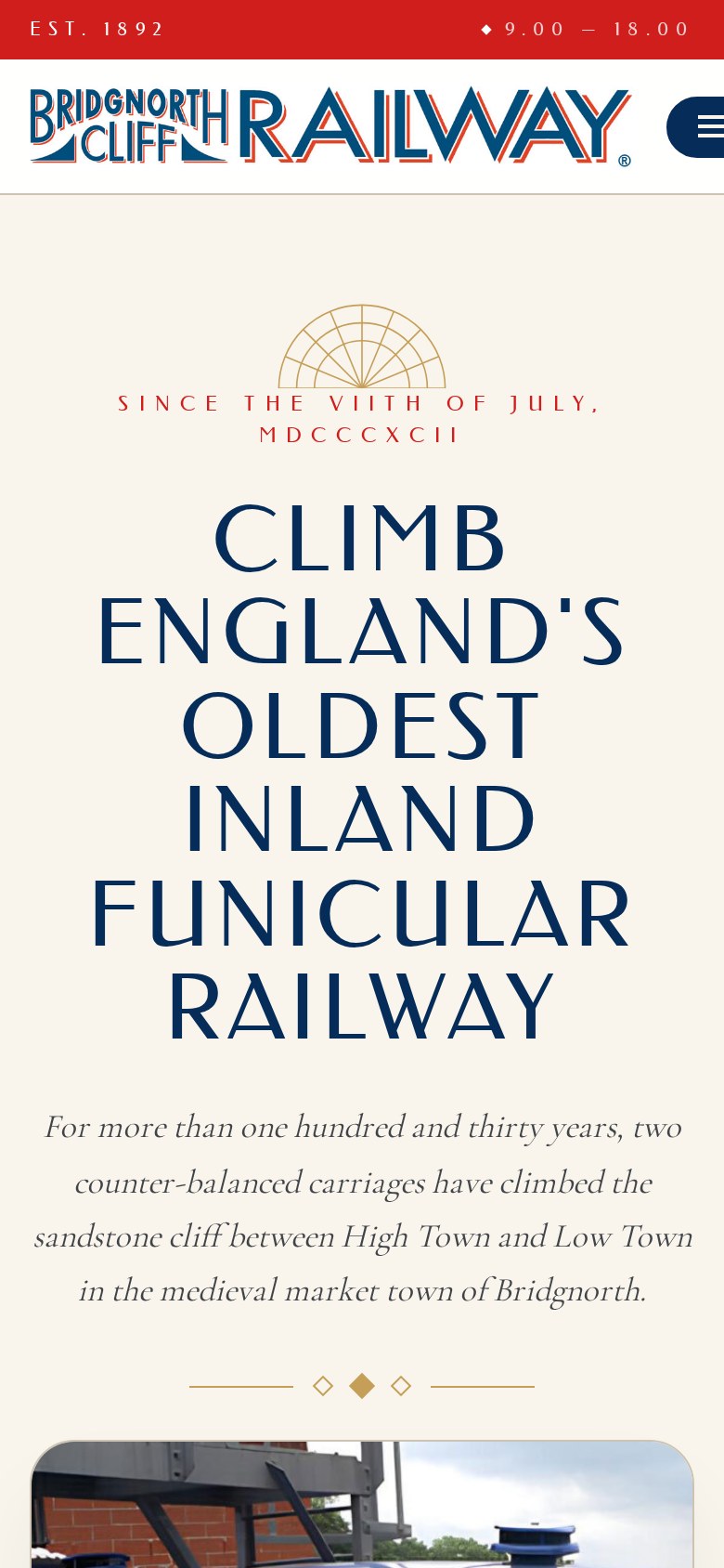
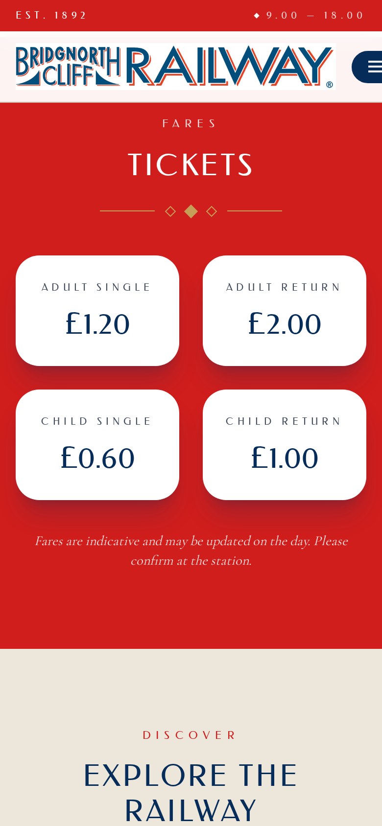
Three quarters of visits happen on a phone, usually outdoors, often one-handed with a child in the other. So the mobile layout isn't a squeezed desktop — it's the primary design. Fares stack into a two-up grid you can read at arm's length, the menu collapses to a single thumb-reachable button, and opening times sit above the fold on every screen size.

The Bridgnorth Cliff Railway homepage on a phone, showing the fan motif, the 1892 date line and the full-height headline
Homepage — the fan motif and headline scale down without losing their presence
The fares section on a phone: four white ticket cards on a red background in a two-column grid
Fares — four prices, two taps from anywhere, legible in daylight

Animation as a heritage celebration

Nothing moves for the sake of moving. Each animation echoes something the railway physically does — counter-balance, ascent, the slow reveal of the view over the Severn as you climb.

The counter-balanced reveal
Paired sections rise and fall in opposition as you scroll, mirroring the two carriages: one climbs while the other descends.
The ascent line
A fine gold rule draws itself up the page at the incline's real 33-degree gradient, tying the history timeline together as you read.
The fan motif
The Victorian fanlight above the headline strokes itself on, spoke by spoke, the way the original signwriting would have been drawn out.
Carriage-livery hovers
Cards lift and shift into the original cream, red and blue livery on hover — colour taken from photographs of the 1892 cars.
Archive fade
Historic photography cross-fades from sepia to full colour as it enters the frame: then and now, in one gesture.

Custom imagery, made for the railway

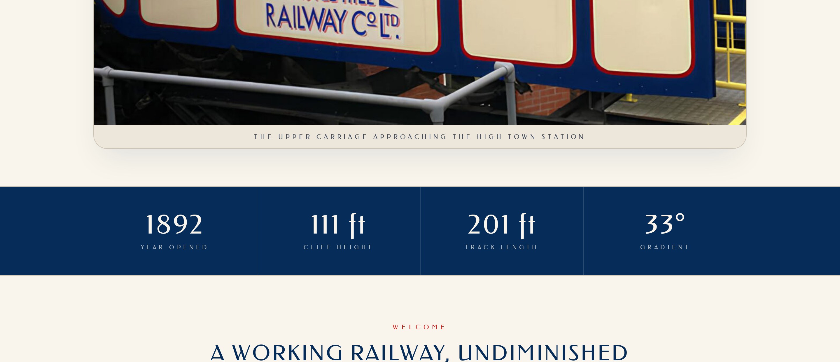
No stock photography anywhere on the site. We shot and art-directed the carriage, the cliff, the winding house and the view, then built a full set of custom graphics — the fanlight motif, the diamond dividers, the ticket cards and the wayfinding icons — from the railway's own Victorian signage.

A photograph of the carriage above a navy band showing 1892, 111ft cliff height, 201ft track length and a 33 degree gradient
Custom carriage photography, captioned in the railway's own signage lettering, over an animated stat band
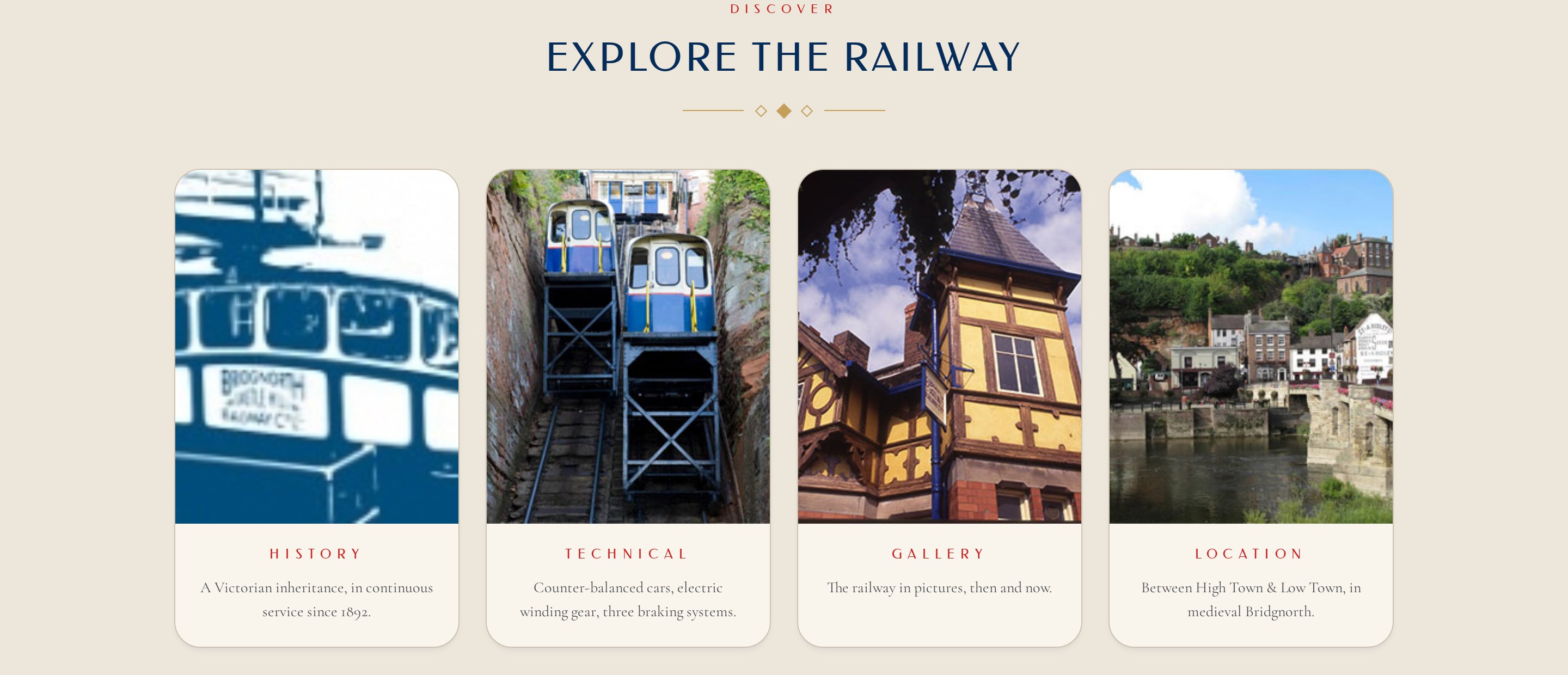
The Explore the Railway section: four photographic cards for history, technical, gallery and location
Explore cards in carriage navy and gold, each one lifting and revealing on hover

The technical bits, animated

The railway is proud of its engineering, and rightly so. Rather than bury the mechanics in a paragraph, we animated them — so a nine-year-old and an engineer both get something out of the same page.

01

The counter-balance, explained

An animated diagram fills and empties the water-balance tanks in sequence, showing how the heavier car pulls the lighter one up.

02

Three braking systems

Each brake — hand, hydraulic and automatic — highlights in turn on a sectional drawing of the car as you step through it.

03

The winding gear

A looping line animation turns the drum and haul rope at true ratio, so the movement on screen matches the movement in the winding house.

04

The gradient in numbers

1892, a 111-foot cliff, 201 feet of track and a 33-degree gradient count up as the band scrolls into view, then hold as a permanent stat line.